Tampax Rebrand Campaign
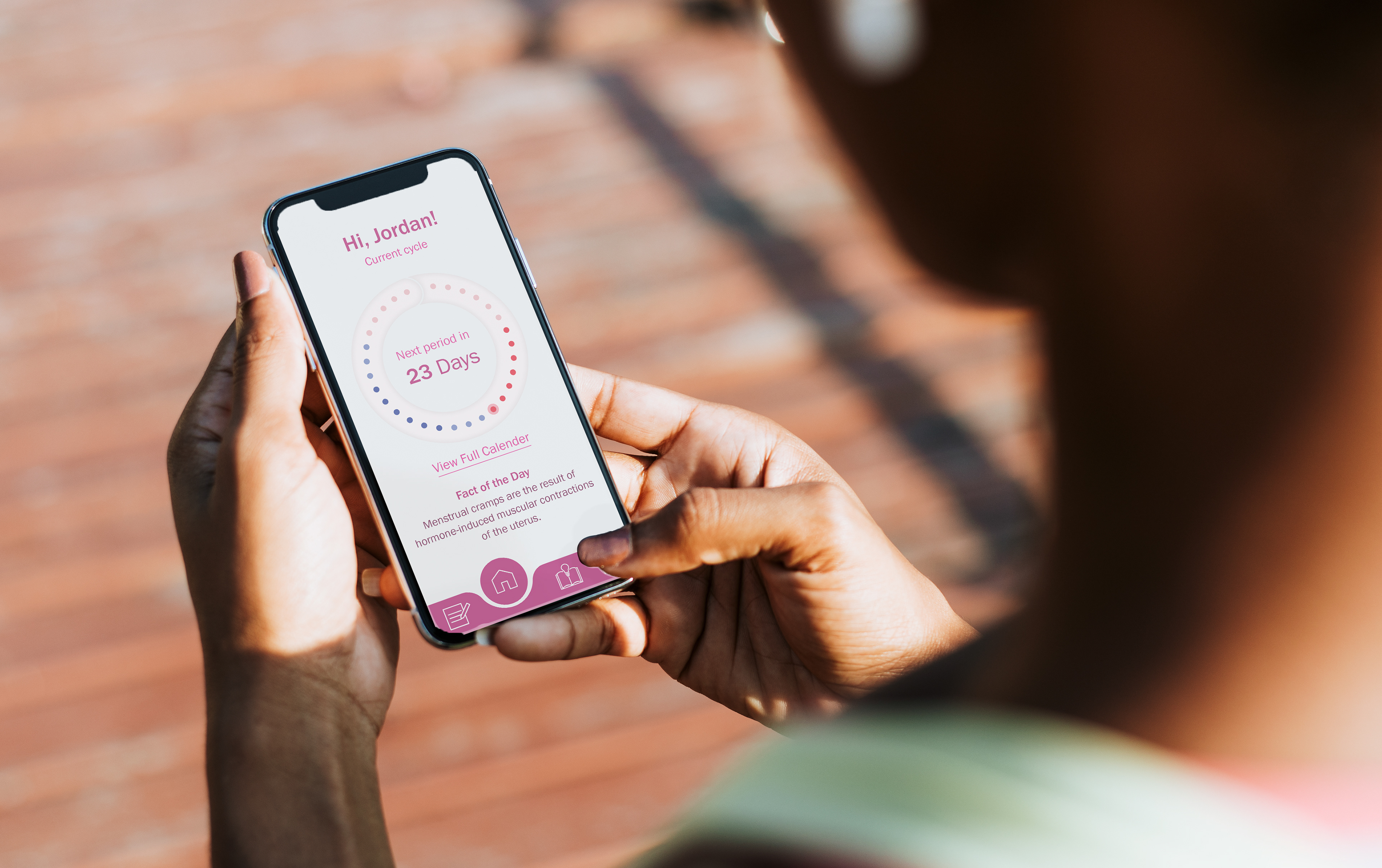
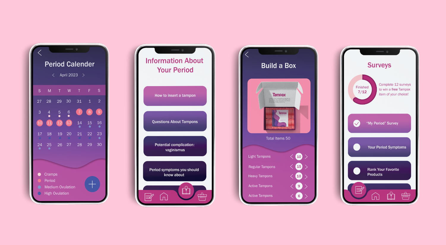
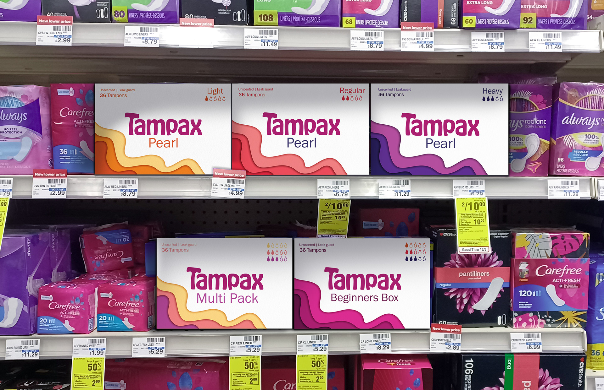
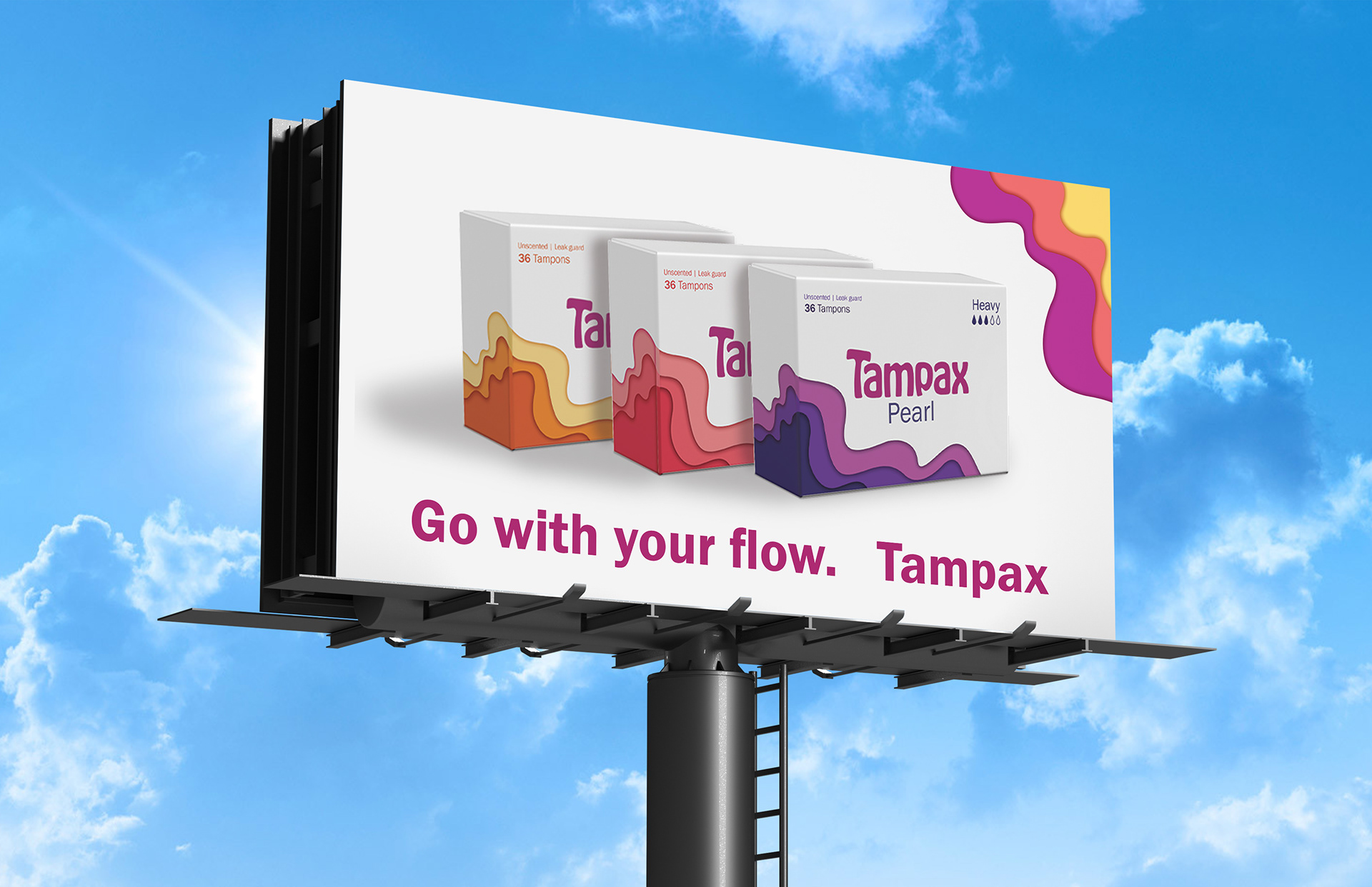
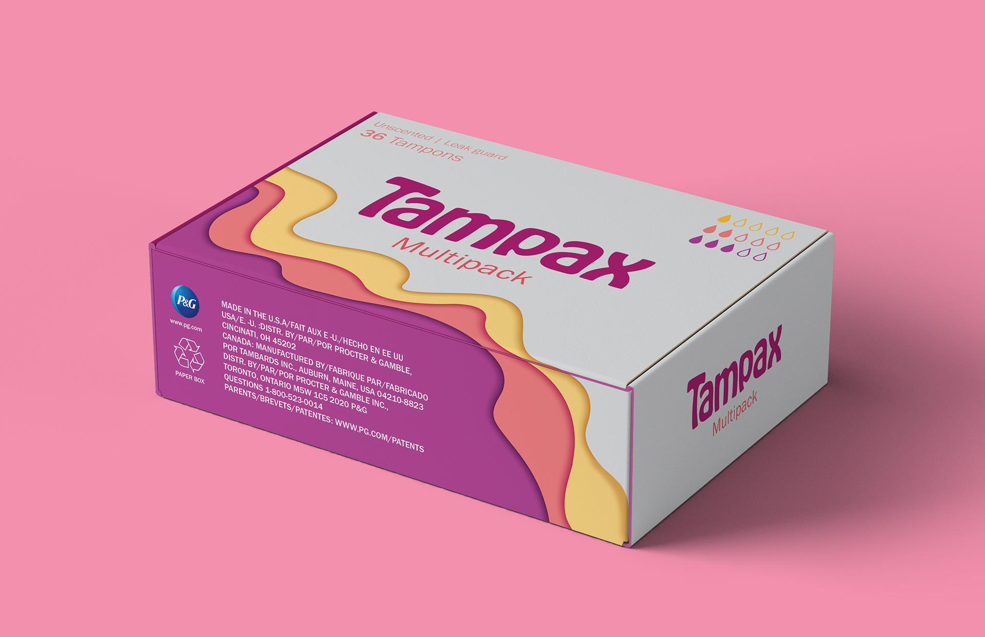
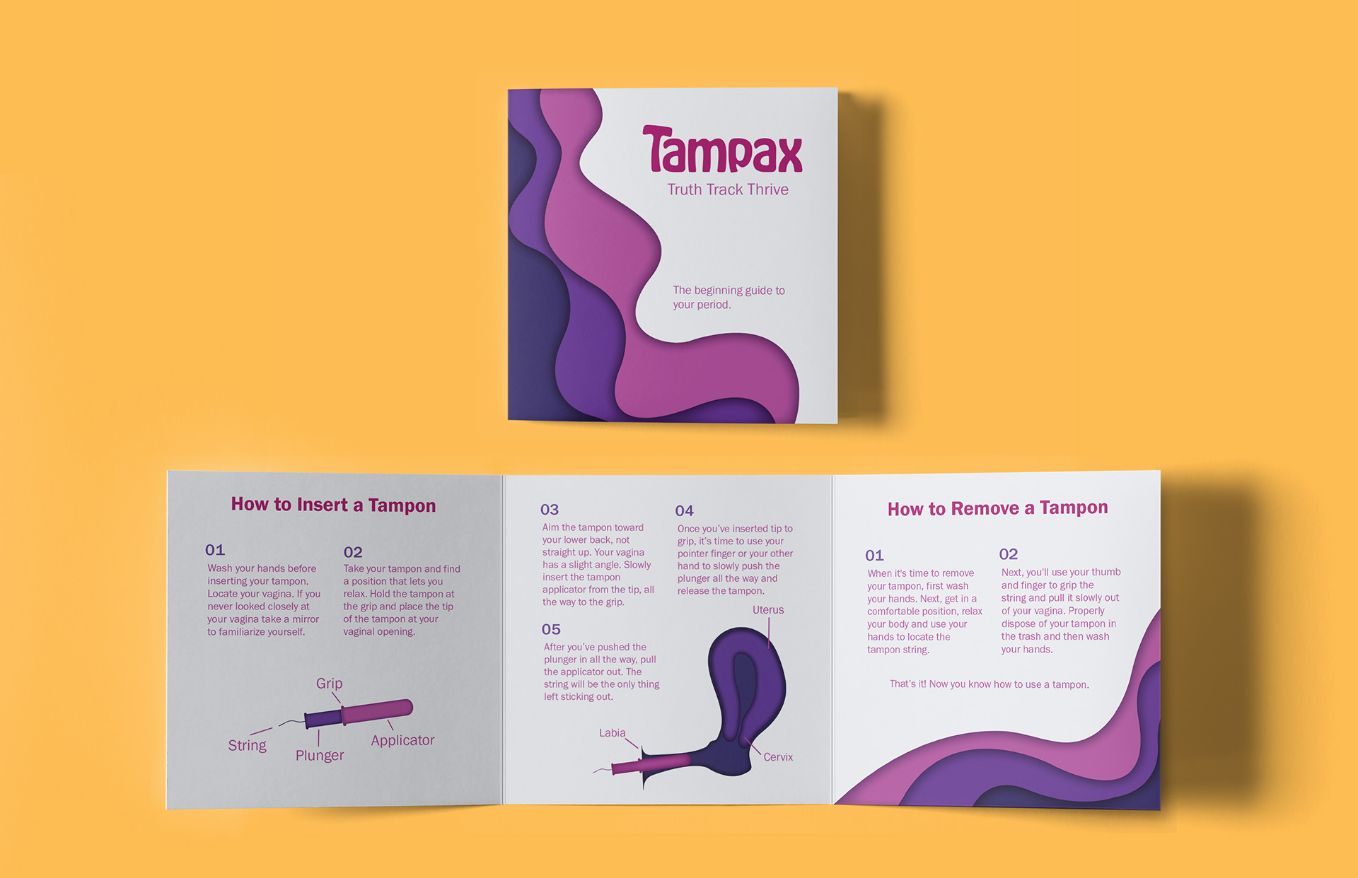
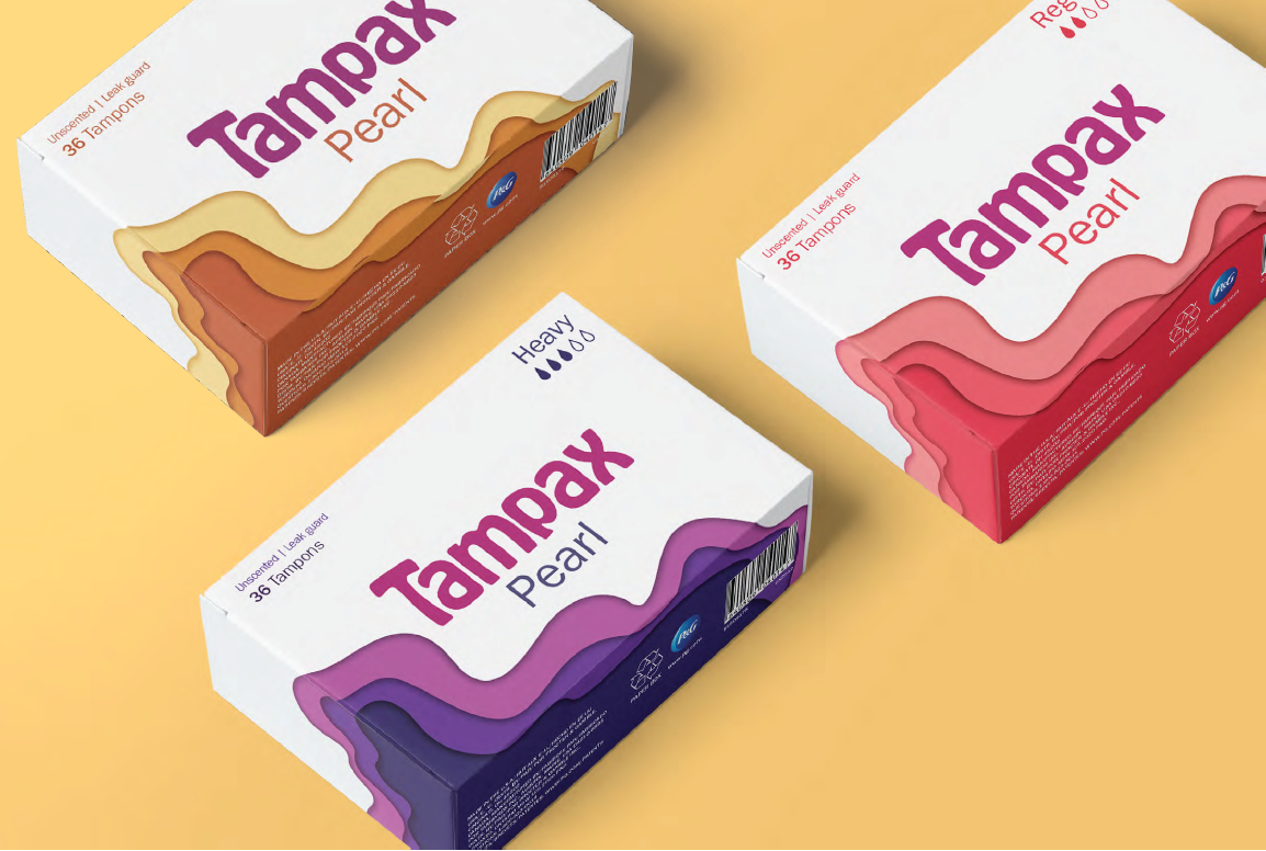
The rebranding campaign for Tampax emphasizes new, easy-to-see and easy-to-read packaging for their tampon and period products. In addition, a new app was introduced to enhance customer experience, offering features such as period tracking, surveys, and an online store.

Logo Treatment
The new logo is built on the Hobeaux typeface, featuring softened corners and a curved 'T' to evoke a sense of comfort and support. These design elements contribute to a welcoming brand identity that resonates with the target audience.