Pink Sugar Rebranding and Packaging Campaign
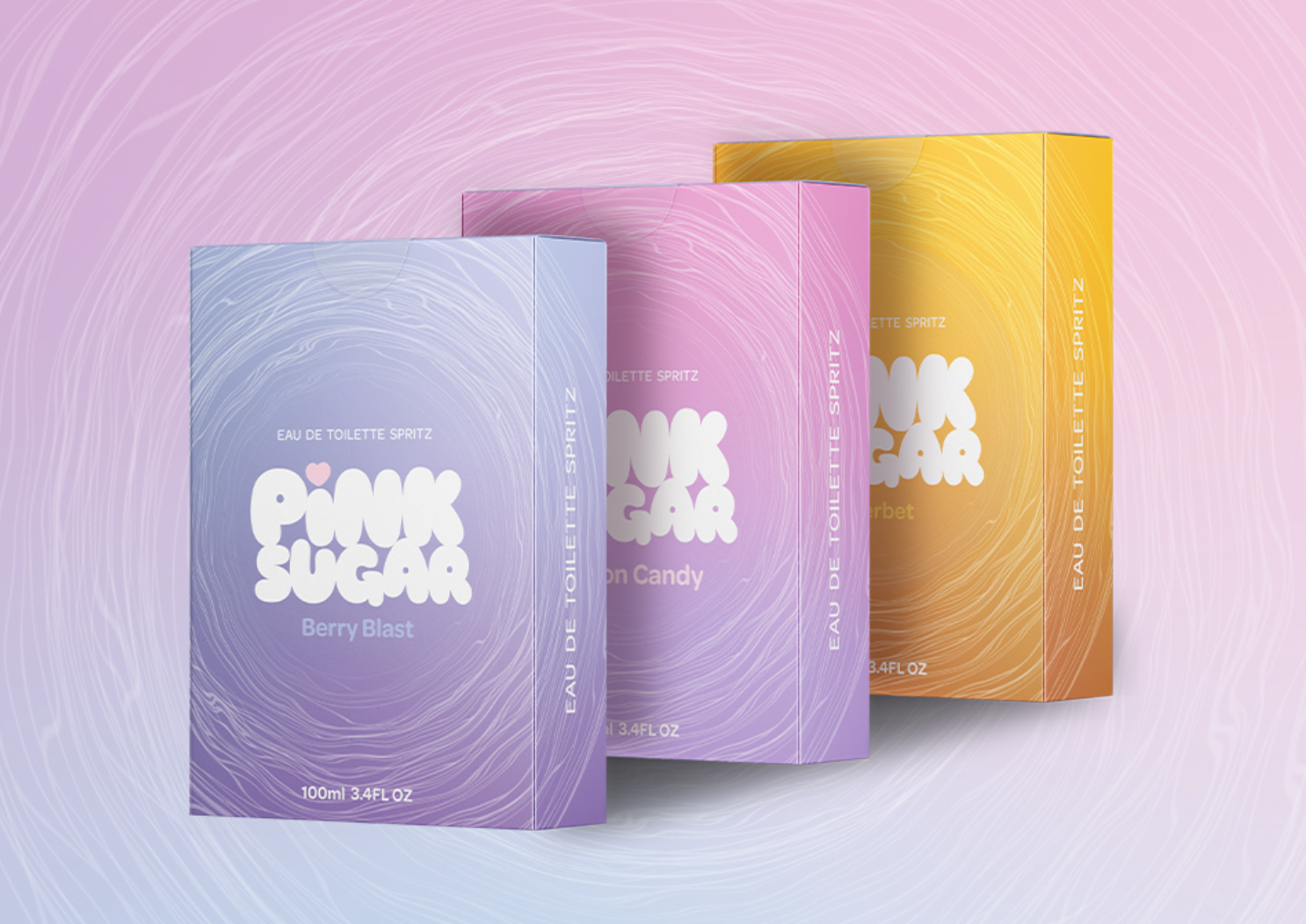
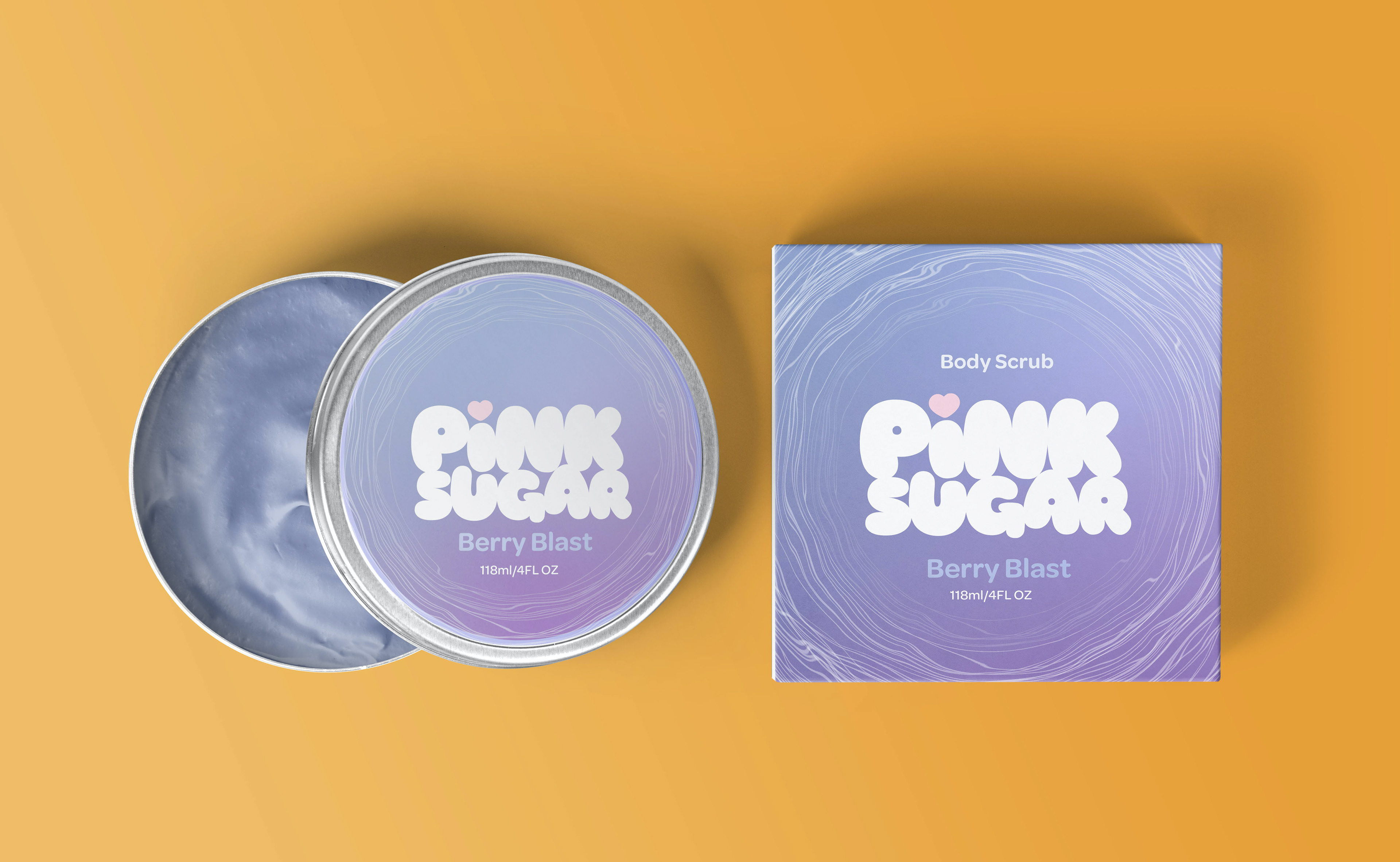
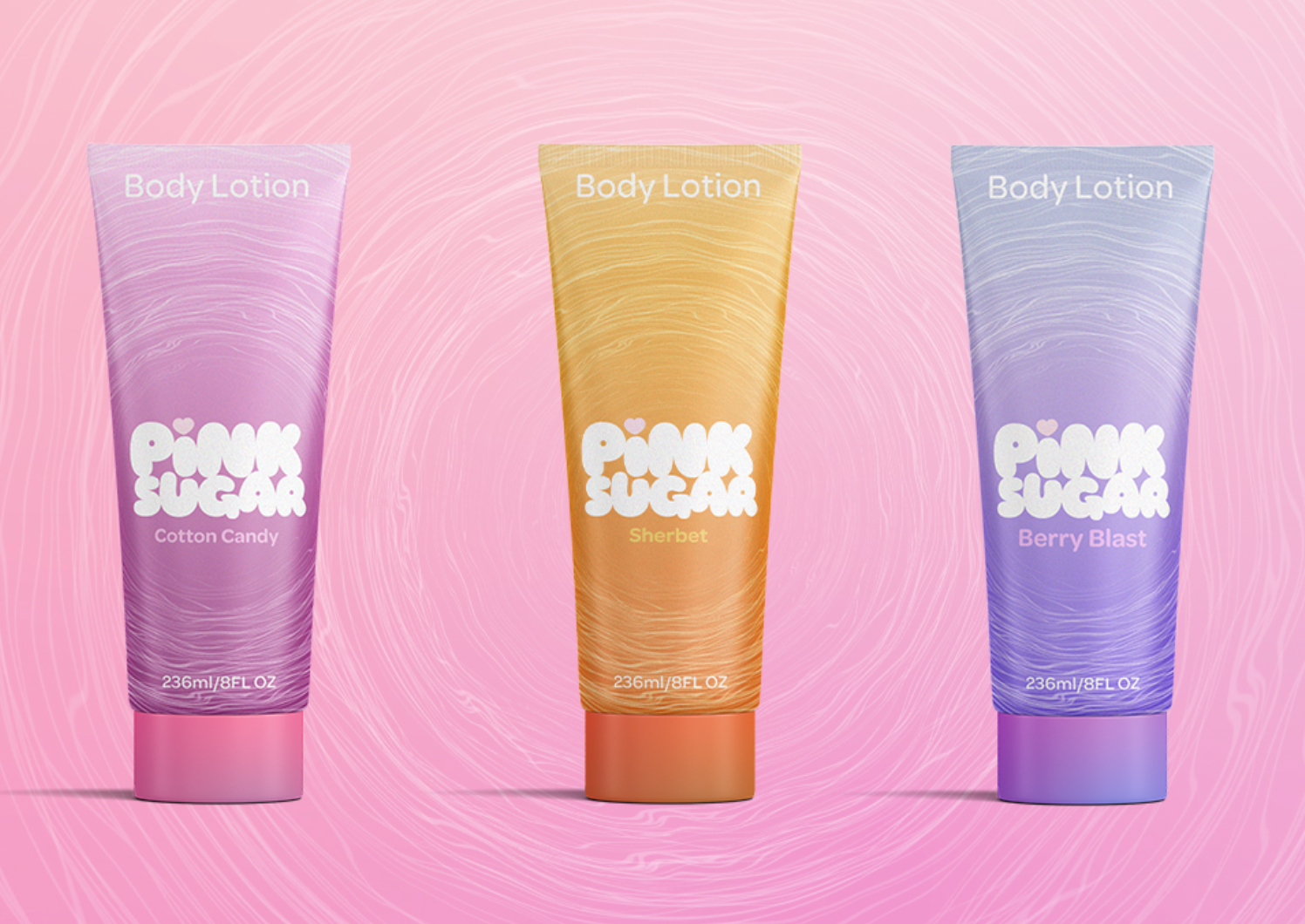
The Pink Sugar rebranding campaign aims to introduce young teens to perfume by transforming the brand from a hyper-feminine image catering to older teens into a bubbly, bright identity that resonates with a younger audience. This case study demonstrates the design process used to broaden the market and reinforce Pink Sugar's reputation as a modern, inclusive brand.
Design Approach
Pink Sugar refreshed its target audience and updated its style to elevate the brand, focusing on bright colors and easy-to-read text to capture consumer attention. The visual design employs delicate floss-like lines to evoke the essence of cotton candy, creating a playful association while maintaining a mature appeal.


